Blurry Backgrounds in Hexo
Making the blog even faster!
I put a lot of effort into the performance of this site. Recently I’ve made changes to the CSS loading, font loading, image loading, and more. All to make this site super fast.
To be fair, none of that is very necessary. This site is no more than a bunch of static files. A lot of markdown and templates that are compiled together using Hexo resulting in some HTML that gets hosted by Netlify. When pages aren’t being generated on the fly, and there’s basically no JavaScript on any given page, performance is already really great.
But it can be better. It can always be a bit better.
The Problem
The problem was on any page that listed posts. Each post has an image (most do, some don’t) and that image is defined in the YAML front-matter of the markdown file:
title: AWH Xamarin Flow
date: 2021-04-28
description:  An MVVM Setup for Xamarin.Forms
image: /images/flow.jpg # <-- This line here!
tags: [.NET, Development, Xamarin, C#, AWH Insights Blog]
So each post has one and only one image. The dimensions on that image are usually around 1000x500 (aiming for about 1000px across with a 2:1 aspect ratio) and they are already as compressed as I am willing to get them. That image is then rendered at the top of the post page. When there’s just one image up there, having it be 200KB is completely fine. Even with some images in the post body, a post page is still a very light page.
But when listing posts, I want the image to be part of that as well, and loading 10 images becomes a problem when then are 30-200KB each. I don’t want to change how images are assigned to posts as I want to keep a single image per post. How can I make the post page lighter while keeping that image?
I need to reiterate that these images are not large and those sizes are not big. I’m chasing small gains here.
The Solution
My first idea for a solution came from finding BlurHash, a way to generate a blurry version of an image that is really small. I loved the aesthetic, I didn’t love the implementation. The hashes are small, but to use them on a page requires JavaScript. Pass.
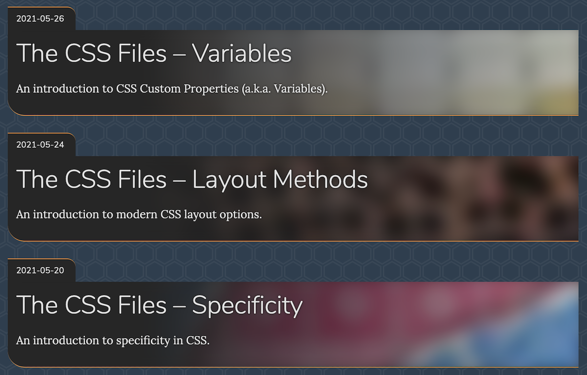
Then I thought about making my own blurry images. The post list design before was already cutting off lots of the image, so making it blurry would not lose me anything. Here’s what I came up with:
- During Hexo’s build process, generate a really small, compressed image and save it as part of the post.
- Use some CSS trickery to blur the background so you don’t notice how terrible that tiny, compressed image looks.
The result is really great:

The process is very similar to the one I used to pre-build the Lunr index for the site. When building, Hexo will run any .js file in the /scripts folder (or in the /scripts folder in your selected theme). This is a way to register hooks into the Hexo build process. After a bunch of trial and error, I ended up with a filter that runs before each post is rendered to HTML.
const log = require('hexo-log')();
const { magenta } = require('chalk');
const path = require('path');
const sharp = require('sharp');

hexo.extend.filter.register('before_post_render', async (post) => {
    if (!post.image)
        return post;

    log.info('Generated thumbnail for: %s', magenta(post.image));

    const imagePath = path.resolve(path.join(hexo.config.source_dir, post.image));

    const data = await sharp(imagePath)
        .resize({ width: 150, height: 50, fit: "cover" }) // Scale down
        .webp({ quality: 33 }) // compress a lot
        .toBuffer();

    post.thumbnail_image = `data:image/webp;base64,${data.toString('base64')}`;

    return post;
});
I’m using Sharp, an image processing library for Node, to resize the images down to fit into 150x60, then converting them to WebP, encoding them as Base64, and finally saving them to the post in a property called thumbnail_image. Then when rendering the post list item in the template, I can use post.thumbnail_image (instead of post.image) when writing the CSS variable that is used for the background image. A resulting image looks something like this:
Looks pretty rough, right? That’s fine as we went from more than 80KB to under 2KB! The CSS blur of the background image is crucial to making that image look good since it will cover up the compression artifacts and leave us with nice blobs of color. Achieving that blur is rather nasty and involves multiple pseudo-elements and absolute positioning. Safari supports a cleaner way using something like background-image: filter(url(...) blur(...)), but no other browser can do that. So pseudo-elements and filter: blur(...) it is.
I think the result is super nice and very lightweight. Each generated image is around 1-3KB, so even having 10 on a single page is fast. And since they are Base64 encoded, they are embedded directly in the HTML so they are loaded with the page and cause no extra network requests.
Remember: with a personal site, it can always be a bit better.
Update with Hexo 7 (July 2024)
Something in Hexo 7 broke this method, but it’s not actually to bad to fix. The main issue is in the filter and it’s that you cannot add a new property to a post using the dot syntax:
// Instead of this:
post.thumbnail_image = `data:image/webp;base64,${data.toString('base64')}`;

// Do this:
post['thumbnail_image'] = `data:image/webp;base64,${data.toString('base64')}`;
And everything works again. Bug logged here.