The CSS Files – Layout Methods
An introduction to modern CSS layout options.
This post was originally written for the AWH Insights Blog. You can read the original post there.
This post is part of a series on CSS:
Since the beginning of the web, developers and designers have wanted to create more and more complex layouts for pages. As the web has evolved, so have the techniques for creating complex layouts. Where we used to use tables to divide up the page into headers, menus, sidebars, and footers, we now have a whole range of choices that can help us layout entire pages or small, simple components.
Knowing what options are available and what each option is capable of is essential to creating complex layouts. Let’s dig into the major options that modern web development has to offer.
Floats
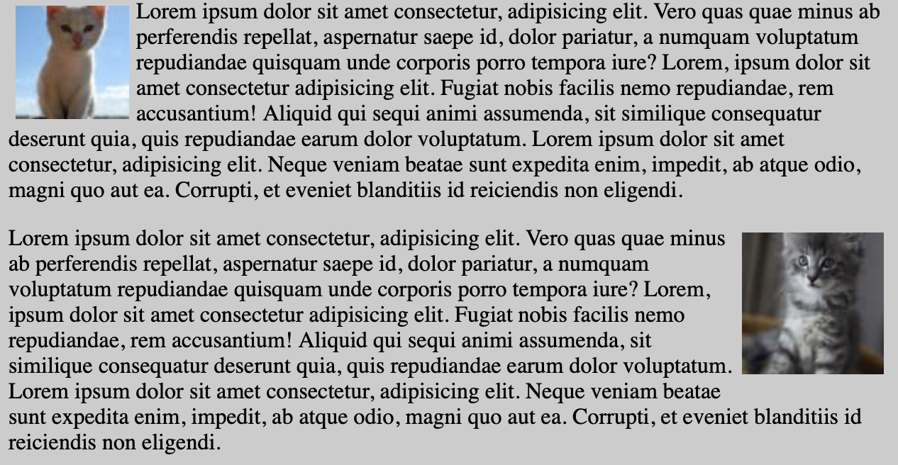
After using tables for layout fell out of style, which was a good thing, floats became the new way of creating layout. It was a perfectly logical choice: normal block elements stack top-to-bottom and floating lets you stack things side-by-side. This is how floating was used in the original Bootstrap grid system. The problem with floats, though, is that they were not intended for building entire page layouts or even smaller component layouts. Like tables, their purpose was a lot more narrow. They were designed to mimic paper layouts where images would be floated left or right, and the text would wrap around them. Floats are great at that:
Many of the issues with using floats for layout were browser-specific (looking at you, IE) but even in modern browsers floats have their quirks. For example, if you have an element where all the children are floated, the parent element will have no height. This is because a floated element is removed from the text flow and thus reports no height to the parent element. There are several ways around this, the most popular being a “clearfix”, but with newer options available floats just aren’t worth the hassle and should be relegated to making text flow around an element.
Flexbox
Flexbox, or the “CSS Flexible Box Layout Module”, is a new CSS display option for creating flexible layouts along a single axis. You set properties on the parent element (flex-flow, justify-content, etc.) and the children will respond automatically. You are easily able to control spacing, alignment, sizing, and ordering of child elements to create complex and useful layouts.
One main advantage of flexbox over floats is that the axis we use is a property and can be changed. Floating only works horizontally, where flexbox is more agnostic about the direction. You can arrange items in rows or columns and even reverse the orientation so items are lined up right-to-left or bottom-to-top.

The AWH site is a good example of flexbox. Looking at the home page banner above, we have the header as a flex container. It’s oriented as a row so the two main blocks are aligned side-by-side. To space the elements out along the main (horizontal) axis, we use justify-content: space-between which keeps the elements at the edge of the container and puts any extra space between them. Since the image has a fixed size, it simply stays on the right side allowing the text block to expand and contract as needed.
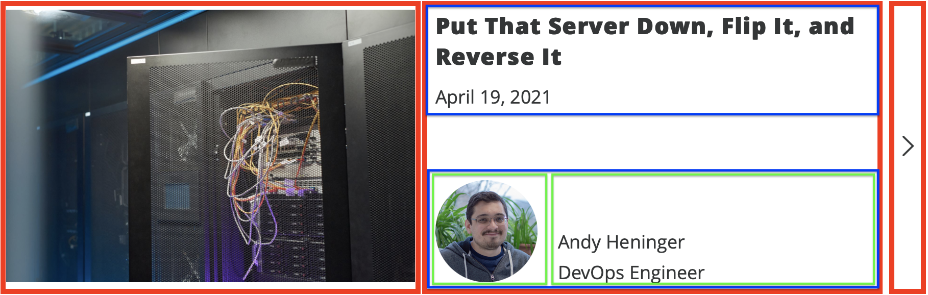
The list of blog posts on the AWH site is another great example of using nested flexbox containers to achieve a more complex layout. Each post in the list is a horizontal container consisting of the image, text, and arrow (the red outlines). The text block is itself a vertical container so we can align the title at the top and the author tag at the bottom (blue outlines). That author tag is yet another nested flexbox container, this time back to horizontal, so we can put the image next to the text (the green outlines).
This kind of nesting is perfectly fine and functional, though it can lead to some messy HTML. In the next section, we’ll see how we can simplify this complex layout.
Grid
Grid is the newest layout option in CSS. It allows for complex, multi-dimensional layouts. Like flexbox, most of the properties are defined on the parent element. When you declare an element to be a grid, you define the number and size of the rows and columns you want. Child elements will automatically fall into these slots, but you can also use manually assign them where they need to go. That last part is especially useful for responsive layouts where you can maintain the same order of your HTML in source while changing the order in which those elements display.
Let’s look back at the blog post component from the previous section and see how we can improve that to use grid. First, we should identify the rows and columns that make up the component. I think the author tag should stay as flexbox, so we should need two rows and three columns, divided up like so:
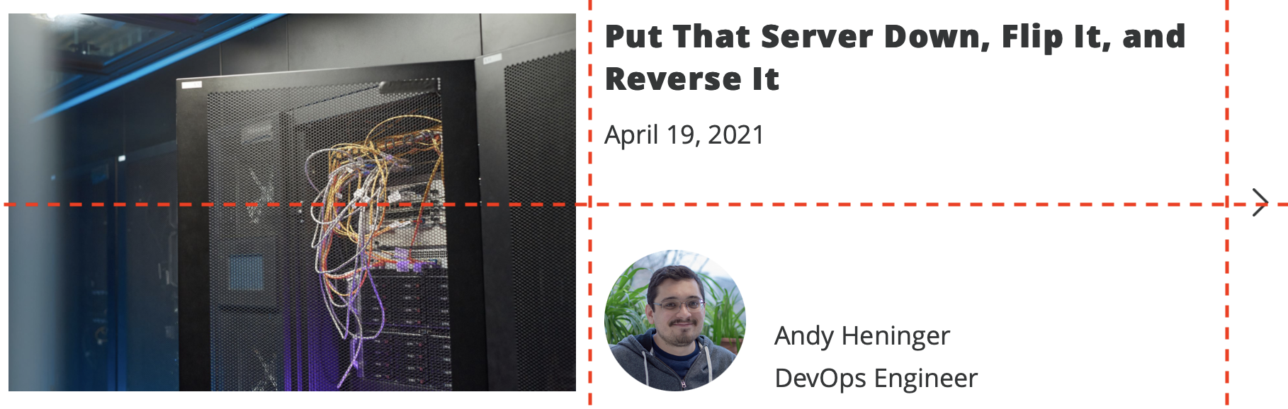
It’s important to know that an element can span multiple cells. We’ll make good use of that fact. Let’s now build some simple, clean HTML to represent this component:
<div class="blog-post">
<img src="..." class="blog-post__image" alt="Blog post image" />
<div class="blog-post__title">
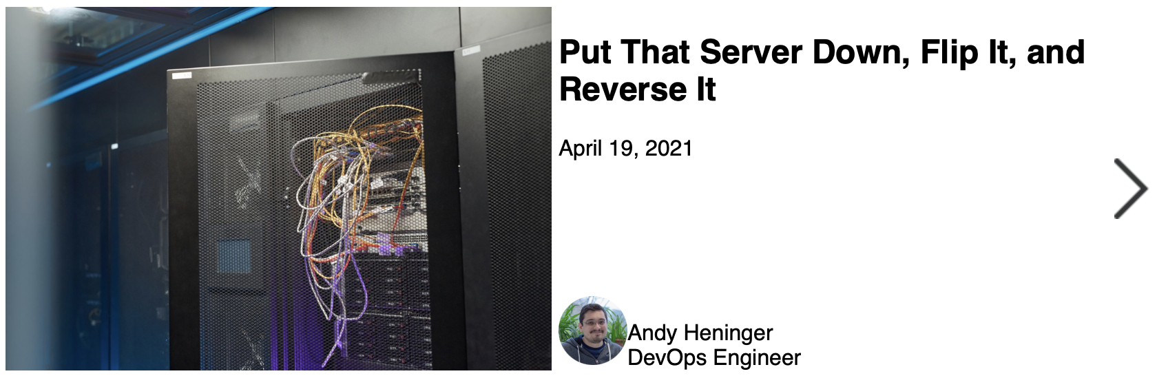
<h2>Put That Server Down, Flip It, and Reverse It</h2>
<p>April 19, 2021</p>
</div>
<div class="blog-post__author">
<div>
<img src="..." alt="Blog post author" class="blog-post__author-image">
</div>
<div>
<div class="blog-post__author-name">Andy Heninger</div>
<div>DevOps Engineer</div>
</div>
</div>
<img src="..." alt="" class="blog-post__arrow">
</div>
That HTML is a lot simpler than the equivalent flexbox code. We don’t need any deep nesting. And now the CSS:
.blog-post {
    display: grid;
    grid-template-columns: 1fr 1fr 30px;
    grid-template-rows: 1fr 1fr;
    grid-template-areas:
        "image title arrow"
        "image author arrow";
    grid-gap: 5px;
}

.blog-post__image {
    grid-area: image;
}

.blog-post__title {
    grid-area: title;
}

.blog-post__author {
    grid-area: author;
    align-self: end;
    display: flex;
    align-items: flex-end;
}

.blog-post__arrow {
    grid-area: arrow;
    justify-self: center;
    align-self: center;
}
I’ve removed some extra lines to keep the snippet shorter. You can view the full code here. I didn’t put too much work into making this look perfect and focused only on the layout, but it matches up quite nicely:
Some things to note:
- When defining the rows and columns, I’m using the
frunit. This is a fractional unit where1frrepresents a fraction of the available space.- There are many more units and functions available when defining the rows and columns. You can use
repeat(),minmax(),min-content,clamp(), and more.
- There are many more units and functions available when defining the rows and columns. You can use
- We are creating “areas” where content can be assigned. This is because we have some content that spans multiple cells and some content that would not be assigned to the right cell using the default ordering. So we create named areas and manually assign each child to an area.
- Notice how we can adjust the alignment of content within each cell independently. This allows us to center the arrow and put the author info at the bottom of the cell.
- Also notice how a grid cell can also be a flex container. We use this for the author tag to keep the parent grid simple.
Which to use?
Here are my general rules:
- For wrapping text around an element like an image: floats.
- When you need to align content along a single axis: flexbox.
- When you need to align content along two axes: grid.
I’ve seen some recommendations to use flexbox for component layouts and grid for page layouts. That is not a bad rule-of-thumb but my preference is to think about needs the particular layout and choose based on that.
CSS has matured a lot in the last 20 years. We no longer have to hack together layouts with tables, frames, or floats. We now have powerful options like grid and flexbox. I encourage you to learn about all of these options so you can pick the best one of the job at hand.
- All About Floats - CSS Tricks
- Floats - MDN
- A Complete Guide to Flexbox - CSS Tricks
- Flexbox - MDN
- A Complete Guide to CSS Grid - CSS Tricks
- Grids - MDN
- Grid for layout, Flexbox for components - Ahmad Shadeed
- Quick! What’s the Difference Between Flexbox and Grid? - CSS Tricks
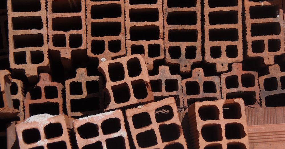
Photo by Tiago Alves on Unsplash